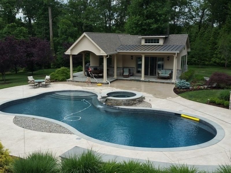
Help from Militello Painting and Powerwashing to make your vision a reality
Choosing paint colors can feel exciting — and overwhelming. You want a look that reflects your personality, complements your home’s architecture, and still stands the test of time. But with thousands of shades and countless lighting conditions, decisions can stall before you ever open a paint can.
At Militello Painting and Powerwashing, serving the Greater Philadelphia area for over 20 years, we’ve helped countless homeowners turn uncertainty into confidence. Whether you’re prepping for a full exterior makeover or refreshing a single room, these expert tips will help you choose colors that look beautiful today — and for years to come.
Clarify Your Vision Before You Choose
Before you even look at paint chips, ask yourself what feeling you want each space to evoke. Are you seeking calm and serenity in a bedroom? Bright and energizing in a kitchen? Or timeless and inviting for your home’s exterior? Pull inspiration from décor you already love — a favorite rug, art piece, or outdoor setting. These pieces often contain color combinations that already “feel right” to you.
Start with a broad vision, then narrow your focus to a palette of 3–4 colors that feel cohesive. This intentional approach helps you avoid random selections that don’t work well together.
Understand How Light Affects Color
One of the biggest surprises for homeowners is how much lighting changes the appearance of paint. A color that looks warm and soft in a shaded hallway might appear cool and muted when hit by afternoon sun. For exteriors, sunlight can even intensify undertones or wash out hues entirely.
Here’s how to think about light:
- Natural light — Try viewing paint samples at different times of day to see how they shift from morning to evening.
- Artificial light — Warm bulbs enhance yellows and reds, while cool bulbs bring out blues and greens.
- Direction of light — North-facing rooms tend to look cooler, while south-facing rooms usually feel warmer.
Sampling small sections of your walls — or even painting peel-and-stick test panels — gives a far more accurate picture than relying on tiny store swatches.
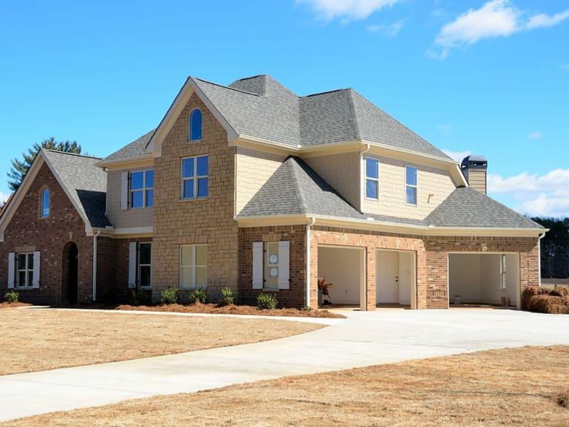
Consider the Permanence of Fixed Features
Your home comes with fixed features — roof shingles, brick, stone, tile, cabinetry, and trim — that won’t change. These elements should be your starting point, not an afterthought. For exteriors, look at the color and undertone of your roof and stone. These materials will influence how new paint looks and will help you choose colors that complement rather than clash.
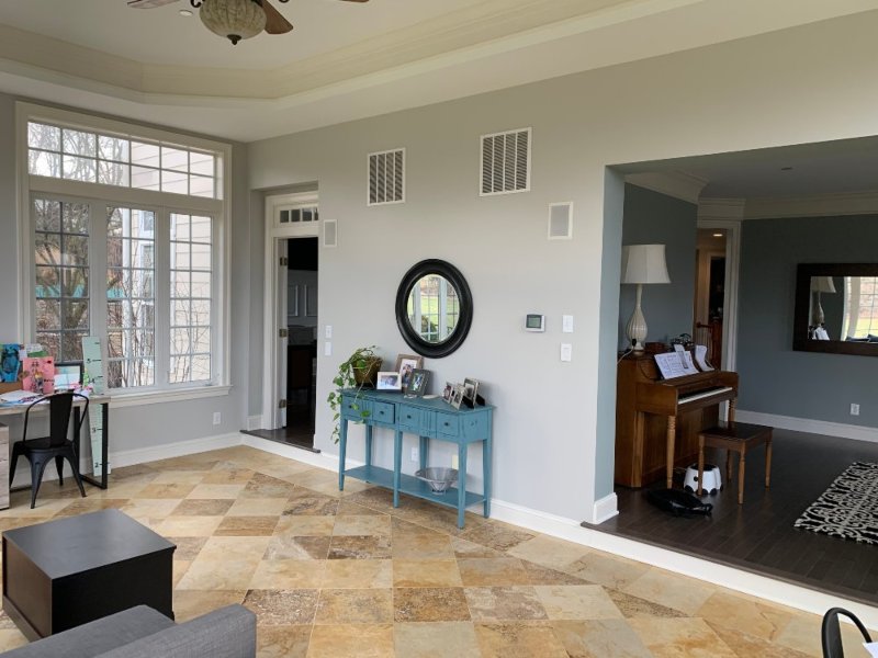
Inside your home, think about flooring, countertops, and cabinetry tones. A warm-toned wood floor might pair beautifully with creamy neutrals but clash with stark cool grays.
Use Designer Rules to Build Harmony
Color professionals often use simple guidelines to take the guesswork out of creating a pleasing palette. One classic method is the 60-30-10 rule:
- 60% dominant wall color
- 30% secondary, complementary tone
- 10% accent color (for trim, doors, or decorative elements)
This rule helps keep color combinations balanced and intentional. For example, a calming warm gray could be your base, with a soft cream as your secondary, and a bold navy on your front door or a single accent wall.
Think Beyond Neutral — But Don’t Ignore It
Neutral tones often get a bad rap as “boring,” but they are timeless for a reason. Warm whites, muted greige, and soft earth tones make spaces feel cohesive and open, while still allowing décor and furnishings to shine. Neutrals also sell well if you’re planning to list your home, since broad appeal is key to buyer interest.
If neutrals feel too safe, incorporate personality through accent colors — perhaps a rich green on kitchen cabinetry or a classic charcoal on exterior shutters. These pops of personality can elevate a space without overwhelming it.
Match Your Neighborhood and Architectural Style
Your home doesn’t exist in a vacuum — it sits within a neighborhood, and that context matters. A striking, bright exterior may be stunning on its own, but feel out of place if every neighboring home is painted in subtle earth tones. In contrast, contemporary homes can often handle more dramatic palettes if they complement the architectural style.
For exterior paint, take cues from nearby homes and from your own landscaping. Earthy tones often harmonize with natural surroundings, while cool hues can accentuate modern architecture.
Quality Paint and Professional Application Matter
Even the perfect color can underperform if the paint itself is low quality or applied poorly. At Militello Painting and Powerwashing, we believe that choosing the right paint is only half the battle — expert application ensures long-lasting beauty and durability. Our team walks clients through color selection and offers insights based on decades of experience painting homes in the Greater Philadelphia area.
We also understand local conditions — from humid summers to cold winters — that can impact how exterior paints perform. That’s why quality products combined with professional techniques make a real difference.
Try Before You Commit
Once you’ve narrowed your choices, paint sample boards or large patches on different walls. Observe how colors look throughout the day and against your furnishings or landscaping. This real-world testing phase saves time and prevents costly mistakes.
And if you’re still unsure? That’s exactly where Militello Painting and Powerwashing shines. Our color consultants can advise you based on your home’s specifics, helping you visualize what works best before a single brush stroke is made.
Final Thought — Your Home, Your Story
Choosing paint colors isn’t just a design task — it’s part of telling your home’s story. Whether you want a tranquil retreat inside or stunning curb appeal outside, the right colors set the mood and make your house feel like yours. And with guidance from professionals who know the Greater Philadelphia area inside and out, you’re never alone in that journey.